This is my final coloured design:
The Process: Choosing and Improving
After creating my 3 designs, I have chosen my main design to improve on and to create my final design. I’ have chosen Design #2 as my final design:
The next step is to create a 6-step-process poster which includes 6 mini posters, being improved on. This is my 6-step-process annotated poster improvement before creating my final lined and coloured poster:
The Process: Creating the 3 Designs (Design #3)
For this design I was inspired by Ludwig van Beethoven’s piece “Piano Sonata No. 17: Tempest” and a quote:
“I have never thought of writing for reputation and honor. What I have in my heart must come out; that is the reason why I compose.”
– Ludwig van Beethoven.
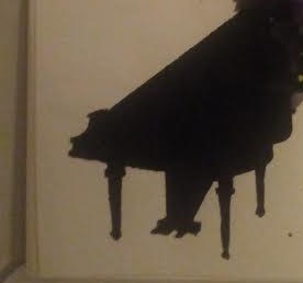
I was also inspired by some pictures:
I first paint the figure of a piano using undiluted watercolour paint:
Then, I added the detailing (outlines, pedals, etc.) of the grand piano using more watercolour paints:
Instead of the background, I wanted musical notes to “explode” out of the piano. By using the technique from Design #1, I created more colourful splatters by using diluted watercolours and letting them half-dry before applying the next layer of colour. Then I added the musical notes by painting them using black undiluted watercolour:
Lastly for the font, I kept it simple and use circles to create the “FGT” letters:

This is my Design #3:
My artistic intention for this design is “Play your Passion”. Just like what Beethoven quoted, he was passionate about his work, and does not care about getting recognition from people; but only play and compose because he has the passion for it. That is how he found his talent and thus gaining more popularity within his audiences. The act of realisation and passion in a field of hobby creates success and happiness. The explosion and continuity of colours and musical notes indicates the hidden passion and talent within an individual (piano).
The Process: Creating the 3 Designs (Design #2)
DESIGN #2
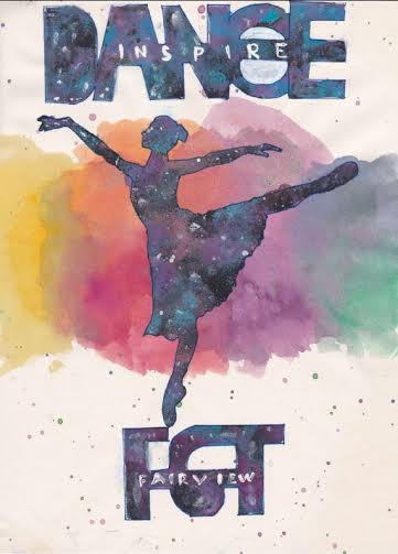
For this design I was inspired after doing a dance rehearsal and after eating some macaroons. Also, continuing with my theme, I included a colourful element to this poster. This time, my chosen gestalt principle is figure and ground.
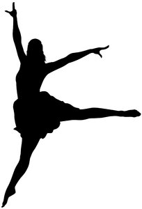
For the figure, I created another stencil of a dancing ballerina:
For the background, I created a soft cloud-like colourful spots and splatter in the middle of the poster with diluted watercolours:
Next, I lay over the stencil in the middle of the background. This time, instead of a plain black figure, I wanted to experiment using different colours and texture. Again with the sponge, I used magenta, blue, and some black undiluted watercolours to create a galaxy-like effect. I then used a little white to splatter on the the figure to imitate stars.
For the fonts, I added the word “DANCE” into the poster. Using the similar galaxy effect, I created the word “DANCE” and “FGT”. I then write the word “INSPIRE” inside “DANCE”, and the word “FAIRVIEW” inside “FGT” with a very fine paint brush.


Lastly, I want over the fonts and figure with a dark blue felt tip marker to fine tune the harsh lines created by the sponge. This is my Design #2:
For this design, my artistic intention is “Dance to Inspire”. Instead of the strong form like the “explosion” from the previous design, I wanted to convey a rather relaxed and casual message to the audience. The soft cloud-like spots in the background relates back to the dance; soft and graceful. It reflects the characteristics of the ballet dance, and also a characteristic of macaroons: delicate.
The galaxy effect of the figure represents the freedom of dancing and also talents: there is no limit to what your talent can lead you to. I chose the word “INSPIRE” to give a very big impression to the audience. In my opinion, “INSPIRE” is a strong word which encourage and influence people that leads into action and realisation. The fonts are galaxy-ed and have another word inside to represent the figure and ground principle.
The Process: Creating the 3 Designs (Design #1)
The first step into creating the designs is to look at the task and information given. In the task sheet, we are supposed to create a poster for Fairview Got Talent talent show. With the given information, we are to create poster that uses the gestalt principle theory we have learnt: continuity, figure and ground, closure, simplicity, similarity and proximity. My concept within all 3 designs is to keep simplicity and are composed of all the topics that I have learnt so far this quarter.
DESIGN #1
In this design, I was inspired by 2 pictures that I thought was appropriate to the talent show.


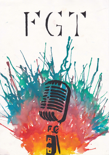
With this inspiration, I created a new version of the microphone into one of the gestalt principle of closure and proximity:
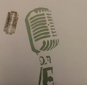
I then did the background by using different colours. As stated earlier, I wanted to corporate colourful elements into the poster.
 I used diluted watercolours (watercolours + water) to make them less denser, hence easier to blow and create the explosion effect. I waited for the colours to dry half-way before applying the next colour so that the colours won’t mix.
Next, I used the stencil with a black undiluted watercolour on a sponge to create the wanted figure. I used the undiluted watercolour because if the consistency is watery, then the colour would easily rundown the paper. I didn’t want that to happen because the figure is quite detailed and are close together.
Lastly, for the “Fairview Got Talent” font, I wanted to continue with the simplicity and closure concept. So I created a simple font for the acronym “FGT”:
I also used a black felt tip market to go over the harsh lines that was created by the sponge when using the stencil. This is my Design #1:
For this design, my artistic intention is “The Explosion of Talent”. I used the different colours and specifically the “explosion” technique for the background to represent the different types of talents people have within themselves, and the microphone is one of the representation of the singing talent. I feel that when I use the microphone as the main figure, people would figure out that it is a talent show because singing is a common talent. The continuity of the colours from a certain spot gives the explosion effect. The organic shapes that are put closely together creates a totality of an existing figure. The reason that the upper part of the poster is empty is because I wanted to create a simple and direct poster, and if I’d drawn something there, it would divert the audience’s attention; thus defeating the meaning of the poster.
Lesson 7: Colours
Today we learnt about the colours inside a colour-wheel. There were a few terms that was introduced.
Colour is one of the elements of arts including value, lines, texture and forms. In art, colour is essential to give a certain object a certain mood to give an impression and message to the audience. There is an infinite amount of colours on Earth. Colours can be group into 3 different categories:
- Primary Colours – colours that can’t be produced by mixing other colours together. These colours are red, blue and yellow.
- Secondary Colours – colours that are made by mixing 2 primary colours together. Primary colours are orange, green and purple.
- Tertiary Colours – colours that are made by mixing 2 secondary colours together. Tertiary colours are red-purple, blue-purple, blue-green, red-orange, yellow-orange and yellow-green.

A common natural example of using colours is the rainbow:
A rainbow has 7 main colours: Red, orange, yellow, green, blue, indigo, and violet.
The colours can also be represented in a colour wheel:

In a colour wheel, a complementary colour is a colour that is opposite to one another. Supposedly, the complimentary colour of orange is blue. The complimentary colour of yellow-orange is blue-violet. Complimentary colours make each other appear brighter when placed next to each other.
Analogous colours are colours that are side by side on the colour wheel. An example of analogous colours are blue-green, green and yellow green.
When you mix all the colours in the colour wheel, you’ll get white. The concept is similar to how a light is refracted into a rainbow through a prism, but reversely.

Colours in the colour wheel can be divided into 2 groups of cool and warm colours. Cool colours are usually dull or has a lower contrast compared to warm colours. Warm colours are very bright.
In the usage of art, these 2 groups represent different emotions. For example, red and green-yellow represent anger or jealousy; orange and yellow represent happiness and excitement. Whilst, indigo and blue represent sadness and loneliness.

