Lesson 2: Narratives in Art

What is a narrative, and how can they be used in art?

Narrative Art

Give 3 examples of artworks that have a narrative. Research them (provide an MLA reference) and evaluate the effectiveness of the way the artists conveys the narrative through their artwork. For example, how is symbolism used? What mood might the colour suggest? Think about how the audience might interpret the artwork – how might 1) a viewer interpret the artwork? 2) you interpret the artwork?

Screen Shot 2016-02-02 at 10.00.00 AM


Lesson 1: What Makes Us, Us?

Unit Plan

Unit Plan


1) What makes you, you?


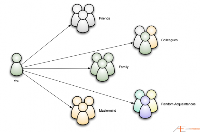
2) How do you present yourself to other people? How does this differ to question 1? How do you represent your identity to:

  • Family?
  • Teacher?
  • Friends?

Presenting ourselves to other people depends on our connection with the other party. It depends whether you have a close or distant relationship with them. The relationship forms through similar personalities (hobbies, perspectives, morals, ethnicity, etc.); and these similarities makes sympathy, attachments and emotional connections because we can relate ourselves with them.

Identity is more on the personal characteristics that an individual has, whereas presenting ourselves is more on the environmental factors that leads into relationships with other people. We can control of how much we want the other party know about our identity (setting boundaries), while we can’t control the development of our identity because it’s controlled by other environmental factors.

With family members I can be open with them because they are the closest people I encounter in life as I grew with them. However, depending on their moral and ethnic beliefs, personality and perspectives, I can control how much identity I show to them. This is because between family, friends and teachers, the environment and situation is different which leads for me to shape a different identity that I don’t necessarily show to my family.

With teachers, I think I’m most distant from them because I don’t spend too much time with them as much as I do with my family and friends. In result to this, I have a higher amount of respect intonation compared to my friends and family. Also, I do not reveal too much of my identity with them. So the amount of time I spend with people reflects my relationship with the other party.

With friends, it is much more comfortable as I am the closest to them because of school. Due to education, I spend most of my time in school (about 9 hours), and naturally make friends to socialise. So in result, I become much more open and close to them than I am with other people.

social-relationships-640x422


3) In 200 words, describe everything about your physical appearance. Detail is important here…

From the top, I have long and wavy hair that frame my oval face and it falls down to my chest of my petite figure. I have wide eyes which usually reflects emptiness and my emotions, while staring at unknown spaces. In between those empty eyes lays my medium-sized nose. Beneath my nose is my thin and small lips. At the side of my face, small and fragile ears are planted. I have no cheek bones, but my cheeks occasionally turns rosy when embarrassed. My shoulders and hips are wide, and waist small. I’m quite short so a lot of people tower my figure as I hid amongst the rest of the crowd. My height shapes my characteristic of shyness and being introvert. I’d stood out of the crowd by wearing daring and aesthetic clothing which shapes my personal style and separates me from the crowd. My personal style ‘defines’ me; from what I wear makes me unique in my small group of people. My arms are slender as it mostly hangs on the sides of my broad shoulders. The fingers long, rooted on my small palms. I’d play around with it when I’m feeling nervous when thousand pairs of eyes are starring at me. My legs are medium length which shapes the rest of my body. It grows from wide thighs to narrow calves. Below that, lays my small feet; my family calls it ‘baby feet’ as it is small as an infant’s feet. In contrast of these small feet, I depend on it the most because without it, I wouldn’t be able to stand properly.

Lesson 3 & 4: Experimenting with Photoshop – Creating a Poster

As we have downloaded the Photoshop, we followed the steps to create a simple poster in the webpage.

1.png

3

5


7

8

9.png

10

11

12

13

14

15

16

17

18

This is the final poster after rendering the picture:

SampleIllustration

Through this experiment, I have learnt that to create a good design; it should include the important information such as venue, date and time so the audience know where and when the event is. Also adding a visual element such as an image that is related to the event will help audience visualize and have an idea what it is about. The 3-dimensional text of the event name emphasize the event and it helps grab people’s attention to make them see the particular text first before other texts in the poster. Creating layers and using contrasting colours between each layer will help to make the main image stand out more from the background layer, thus making it clear for the audience and more visually appealing.

The Process: Choosing and Improving

After creating my 3 designs, I have chosen my main design to improve on and to create my final design. I’ have chosen Design #2 as my final design:

design #2

The next step is to create a 6-step-process poster which includes 6 mini posters, being improved on. This is my 6-step-process annotated poster improvement before creating my final lined and coloured poster:

IMG_20150916_122732

The Process: Creating the 3 Designs (Design #3)

For this design I was inspired by Ludwig van Beethoven’s piece “Piano Sonata No. 17: Tempest” and a quote:


“I have never thought of writing for reputation and honor. What I have in my heart must come out; that is the reason why I compose.”
– Ludwig van Beethoven.

I was also inspired by some pictures:

27903showing

26345988-Freeze-motion-of-colored-dust-explosion-isolated-on-white--Stock-Photo

I first paint the figure of a piano using undiluted watercolour paint:

unnamed (1)

Then, I added the detailing (outlines, pedals, etc.) of the grand piano using more watercolour paints:

unnamed (2)

Instead of the background, I wanted musical notes to “explode” out of the piano. By using the technique from Design #1, I created more colourful splatters by using diluted watercolours and letting them half-dry before applying the next layer of colour. Then I added the musical notes by painting them using black undiluted watercolour:

unnamed (4)

Lastly for the font, I kept it simple and use circles to create the “FGT” letters:

design #3
Law of similarity and proximity.

This is my Design #3:

design #3

My artistic intention for this design is “Play your Passion”. Just like what Beethoven quoted, he was passionate about his work, and does not care about getting recognition from people; but only play and compose because he has the passion for it. That is how he found his talent and thus gaining more popularity within his audiences. The act of realisation and passion in a field of hobby creates success and happiness. The explosion and continuity of colours and musical notes indicates the hidden passion and talent within an individual (piano).

The Process: Creating the 3 Designs (Design #2)

DESIGN #2

For this design I was inspired after doing a dance rehearsal and after eating some macaroons. Also, continuing with my theme, I included a colourful element to this poster. This time, my chosen gestalt principle is figure and ground.

meZHdVs

macaroons

For the figure, I created another stencil of a dancing ballerina:

unnamed (2)

For the background, I created a soft cloud-like colourful spots and splatter in the middle of the poster with diluted watercolours:

unnamed (1)

Next, I lay over the stencil in the middle of the background. This time, instead of a plain black figure, I wanted to experiment using different colours and texture. Again with the sponge, I used magenta, blue, and some black undiluted watercolours to create a galaxy-like effect. I then used a little white to splatter on the the figure to imitate stars.

unnamed

unnamed (3)

For the fonts, I added the word “DANCE” into the poster. Using the similar galaxy effect, I created the word “DANCE” and “FGT”. I then write the word “INSPIRE” inside “DANCE”, and the word “FAIRVIEW” inside “FGT” with a very fine paint brush.

"INSPIRE" inside "DANCE"
“INSPIRE” inside “DANCE”
"FAIRVIEW" inside "FGT"
“FAIRVIEW” inside “FGT”

Lastly, I want over the fonts and figure with a dark blue felt tip marker to fine tune the harsh lines created by the sponge. This is my Design #2:

design #2

For this design, my artistic intention is “Dance to Inspire”. Instead of the strong form like the “explosion” from the previous design, I wanted to convey a rather relaxed and casual message to the audience. The soft cloud-like spots in the background relates back to the dance; soft and graceful. It reflects the characteristics of the ballet dance, and also a characteristic of macaroons: delicate.

The galaxy effect of the figure represents the freedom of dancing and also talents: there is no limit to what your talent can lead you to. I chose the word “INSPIRE” to give a very big impression to the audience. In my opinion, “INSPIRE” is a strong word which encourage and influence people that leads into action and realisation. The fonts are galaxy-ed and have another word inside to represent the figure and ground principle.